
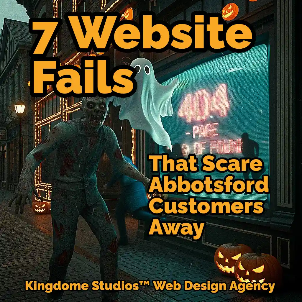
👻 Top 7 Ways Abbotsford Business Websites Secretly Scare Customers Away
"Is your Abbotsford business website secretly scaring customers away? It’s a chilling thought, but it happens more often than you think."
Is your Abbotsford business website secretly scaring customers away? It’s a chilling thought, but it happens more often than you think. A potential customer, perhaps hearing about you from a friend they met at a coffee shop in Historic Downtown Abbotsford, decides to look you up. They pull out their phone, full of optimism, and land on your homepage. But instead of being welcomed, they’re met with a digital haunted house. Creaky loading times, a confusing layout, and ghosts of designs past send them running for the digital hills, straight into the arms of your competitor. These website horror stories are playing out every day across the Fraser Valley, and the scariest part is, most business owners don’t even know their website is the villain.
This isn’t just about looking pretty. Your website is your digital storefront on South Fraser Way, your 24/7 brand ambassador, and your hardest-working salesperson. If it’s not performing, it’s actively costing you money. The good news? These digital demons can be exorcised. We’re pulling back the curtain to reveal the top 7 ways Abbotsford business websites are secretly sabotaging their success. Consider this your ghost-hunting guide to a more profitable online presence.
1. The Ghost of Websites Past (The 2010 Time Warp)
The Scare: You know it when you see it. The website looks like it was designed during the last Canucks playoff run that people actually talk about. It features tiny, pixelated images, fonts that belong on a high school project (hello, Comic Sans), and maybe even a “Best viewed in Internet Explorer” badge in the footer. The layout is rigid, the colours are jarring, and it feels less like a modern business and more like a digital fossil from a bygone era.
The Local Analogy: Imagine walking into a brand new, high-tech UFV building, but all the computers are those bulky, beige-box monitors from the 90s. Or trying to convince someone your restaurant is “Farm to Table” fresh, but your website looks like a dusty, laminated menu from a diner that closed ten years ago. It’s the digital equivalent of seeing a flip phone in an Apple Store—it’s so out of place, it instantly shatters any illusion of being current, professional, or trustworthy.
The Damage: A dated design is a silent killer of credibility. It screams “neglect” to your visitors. If you can’t be bothered to update your own website, why would they trust you to provide modern, high-quality products or services? It suggests your business is out of touch, struggling, or worse, no longer operational. The bounce rate on these sites is astronomical because users subconsciously associate an old design with an untrustworthy company.
The Kingdome Cure: The only way to exorcise this ghost is with a complete redesign. This doesn’t mean just a new coat of paint; it means a ground-up reimagining of your digital presence. Through custom web design, we create a visually stunning, modern, and professional website that accurately reflects the quality and ambition of your 2025 Abbotsford business. We ensure your digital storefront looks as impressive as the view from the top of Sumas Mountain.
2. The Labyrinth of Lost Links (The Contact Info Maze)
The Scare: A potential customer is sold. They love your services, they’re impressed by your project gallery, and they are ready to give you their money. All they need is your phone number or address. They click “Contact Us.” Nothing. They scroll to the footer. Nothing. They check the “About Us” page. Still nothing. They are trapped in a confusing maze of links and pages, with no clear way to take the next step. Their initial excitement curdles into pure frustration.
The Local Analogy: This is the digital equivalent of trying to find the exit at the Abbotsford Agrifair after dark. You know it’s there somewhere, but you’re lost in a sea of attractions, strange noises, and you’re getting increasingly annoyed. Or worse, it’s like trying to find a specific parking spot at Highstreet Shopping Centre on a Saturday in December—a maddening, hopeless quest that usually ends with you giving up and going somewhere else.
The Damage: This is one of the most tragic and easily avoidable website sins. You have done all the hard work to convince a customer, only to fail at the final hurdle. Every second they spend hunting for your contact information increases the likelihood they will close the tab and search for a competitor whose phone number is proudly displayed at the top of their page. You’re not just losing a lead; you’re losing a guaranteed sale due to poor navigation.
The Kingdome Cure: A website’s primary goal is to make it incredibly easy for customers to take action. This is achieved through strategic and intuitive UI/UX design. We ensure your phone number is clickable on mobile, your address links to Google Maps, and your contact forms are simple and prominent. We architect your site’s navigation so that a user is never more than a single click away from being able to connect with you.
3. The Incredible Shrinking Text Monster (The Mobile Pinch-and-Zoom Nightmare)
The Scare: A customer finds your business on their phone while waiting for their flight at Abbotsford International Airport (YXX). They tap the link, and your beautiful desktop website appears… squished onto their 6-inch screen. The text is microscopic. The links are so tiny and close together that their thumb covers three at once. They are forced into the dreaded “pinch, zoom, and scroll” dance, trying desperately to navigate a site that clearly wasn’t built for them.
The Local Analogy: It’s like trying to read the fine print on a concert ticket in the dim light of the Abbotsford Centre while the opening act is playing. You know the information you need is there, but it’s an infuriating struggle to actually see it. It’s an experience that is immediately hostile to the user.
The Damage: This is a business-ender in the modern era. Over half of all web traffic comes from mobile devices. If your website isn’t optimized for mobile, you are actively telling the majority of your potential customers that you don’t care about their experience. Google agrees; since 2019, they have prioritized mobile versions of websites for ranking. A bad mobile experience doesn’t just scare away users; it makes you practically invisible on search engines.
The Kingdome Cure: Every single website we build is created with a mobile-first responsive design philosophy. This means we design the experience for the smallest screen first and then scale it up to larger devices. The result is a seamless, intuitive, and beautiful experience for every user, whether they’re on a phone at a local brewery, a tablet at home, or a desktop in their office.
4. The Sloth of South Fraser Way (The Website That Takes Forever)
The Scare: Click. The screen is white. One second passes. Two seconds. A loading icon appears, spinning… spinning. The user can almost hear the dial-up modem sounds of their youth. By the time your homepage finally stutters into view, their patience has evaporated, and they’ve already moved on.
The Local Analogy: This is the online version of being stuck in traffic on Highway 1 during the Abbotsford Airshow weekend. The destination might be amazing, but the journey is so painfully slow and frustrating that you’re tempted to just turn around and go home. Your website’s loading time is the new traffic jam, and today’s users have zero patience for it.
The Damage: Speed isn’t a feature; it’s a fundamental requirement. Studies have shown that even a one-second delay in page load time can result in a significant drop in conversions. A slow website leads to higher bounce rates, which tells Google that your site provides a poor user experience, hurting your SEO rankings. The damage is twofold: you lose the impatient visitor, and you lose visibility for future visitors.
The Kingdome Cure: A fast website is the result of clean code, optimized images, and a powerful hosting foundation. Our development process is centered on performance optimization. We ensure your website is a lean, mean, fighting machine, built to load in the blink of an eye. We understand that in the race for customer attention, speed wins every time.
5. The Curse of the Casual Browser (The "What Do I Do Now?" Void)
The Scare: The user has landed on your service page. They’ve read the beautifully written copy. They’ve looked at the professional photos. They are intrigued, maybe even convinced. And then… nothing. Crickets. There’s no button to click, no form to fill out, no clear next step. The page just… ends. The user is left wondering, “Okay… so what now?”
The Local Analogy: Imagine you’ve just enjoyed a fantastic tour of Clayburn Village and you’re inspired to buy some of the local artisan goods you saw. You walk into the gift shop, ready to buy, but there’s no cash register, no staff, and no price tags. You’re a motivated buyer with nowhere to go. You’ll just leave, confused and disappointed.
The Damage: This is a colossal waste of marketing effort. You’ve successfully guided a customer all the way to the goal line and then forgotten to put up a goalpost. Without clear and compelling Calls-to-Action (CTAs), your website is a passive brochure, not an active sales tool. It fails to convert interest into action, leaving a trail of lost leads and squandered opportunities.
The Kingdome Cure: We bake a strategic CTA strategy into the very fabric of your website. This is the heart of conversion-focused web design. Every page is designed with a specific goal in mind and features clear, compelling CTAs—like “Get a Free Quote,” “Schedule a Consultation,” or “Shop Now”—that guide the user on a seamless journey from casual browser to paying customer.
6. The Invasion of the Stock Photo People (The Uncanny Valley Vibe)
The Scare: Your website claims you’re a proud, local Abbotsford company, but the homepage features a suspiciously generic group of ethnically diverse models in sharp suits, high-fiving in a boardroom that looks suspiciously like a skyscraper in Chicago. The photos are glossy and perfect, but also completely soulless and fake. They feel disconnected from the community you claim to serve.
The Local Analogy: It’s like a restaurant in the heart of Abbotsford’s farmland promoting its “local, farm-fresh ingredients” with pictures of produce from a generic international supermarket. It immediately creates a disconnect and a sense of distrust. It feels inauthentic, and in a community-focused place like the Fraser Valley, authenticity is everything.
The Damage: Bad or generic stock photography breaks trust. It tells your customers that you’re not willing to invest in showing them who you really are. It prevents any real emotional connection and makes your brand feel sterile and corporate. It’s a missed opportunity to showcase your unique team, location, and what makes your business a genuine part of the Abbotsford community.
The Kingdome Cure: The most powerful way to build trust is to be real. We champion professional website photography and videography that captures the authentic soul of your brand. We’ll photograph your actual team, your real location, and your products in the context of our beautiful Fraser Valley, creating a visual library that is 100% unique to you and deeply resonant with your local audience.
7. The Invisible Business of Mill Lake (The Website Google Can't Find)
The Scare: This is the most insidious monster of all because everything can look perfect on the surface. You have a beautiful, fast, mobile-friendly website with authentic photos and clear calls-to-action. The problem? Nobody can find it. When potential customers search Google for “landscapers in Abbotsford” or “best accountants Fraser Valley,” your website is nowhere to be seen. It’s a digital ghost, invisible to the very people you’re trying to reach.
The Local Analogy: This is like setting up the most incredible, can’t-miss booth for the Abbotsford Tulip Festival, but placing it in a back alley three blocks away with no signs pointing to it. You could have the best product in the world, but if no one can find you, you don’t exist.
The Damage: A website without SEO is a billboard in the desert. The vast majority of online experiences begin with a search engine, and if you’re not on the first page, you are losing out on a massive stream of qualified, motivated customers every single day. Without a strong search presence, your beautiful website is a wasted investment.
The Kingdome Cure: SEO isn’t an add-on; it’s a foundational element. Every website we build is created upon a foundational SEO setup. We perform keyword research, optimize your site structure, write search-friendly title tags and meta descriptions, and ensure your site is technically sound and ready for Google to crawl and rank. We make sure that when a customer is looking for you, your kingdom is the first one they find.
😈 Your Exorcism Begins Now
Is your website haunted by one—or more—of these digital demons? Are you tired of watching potential customers run away in fear or frustration? The good news is, you don’t have to fight them alone.
Kingdome Studios is Abbotsford’s premier team of digital ghostbusters. We specialize in transforming haunted, underperforming websites into powerful, lead-generating fortresses. We combine stunning custom design with strategic thinking and technical excellence to create an online presence that doesn’t just attract customers, but captivates them.
Stop letting your website be a liability. It’s time to invest in a digital kingdom that reflects the true quality of your business and works tirelessly to grow your empire.