
The Top 10 First Impressions Your Abbotsford Website Gives (Before They Read a Word)
"Did you know it takes about 50 milliseconds for a visitor to form a first impression of your Abbotsford website?"
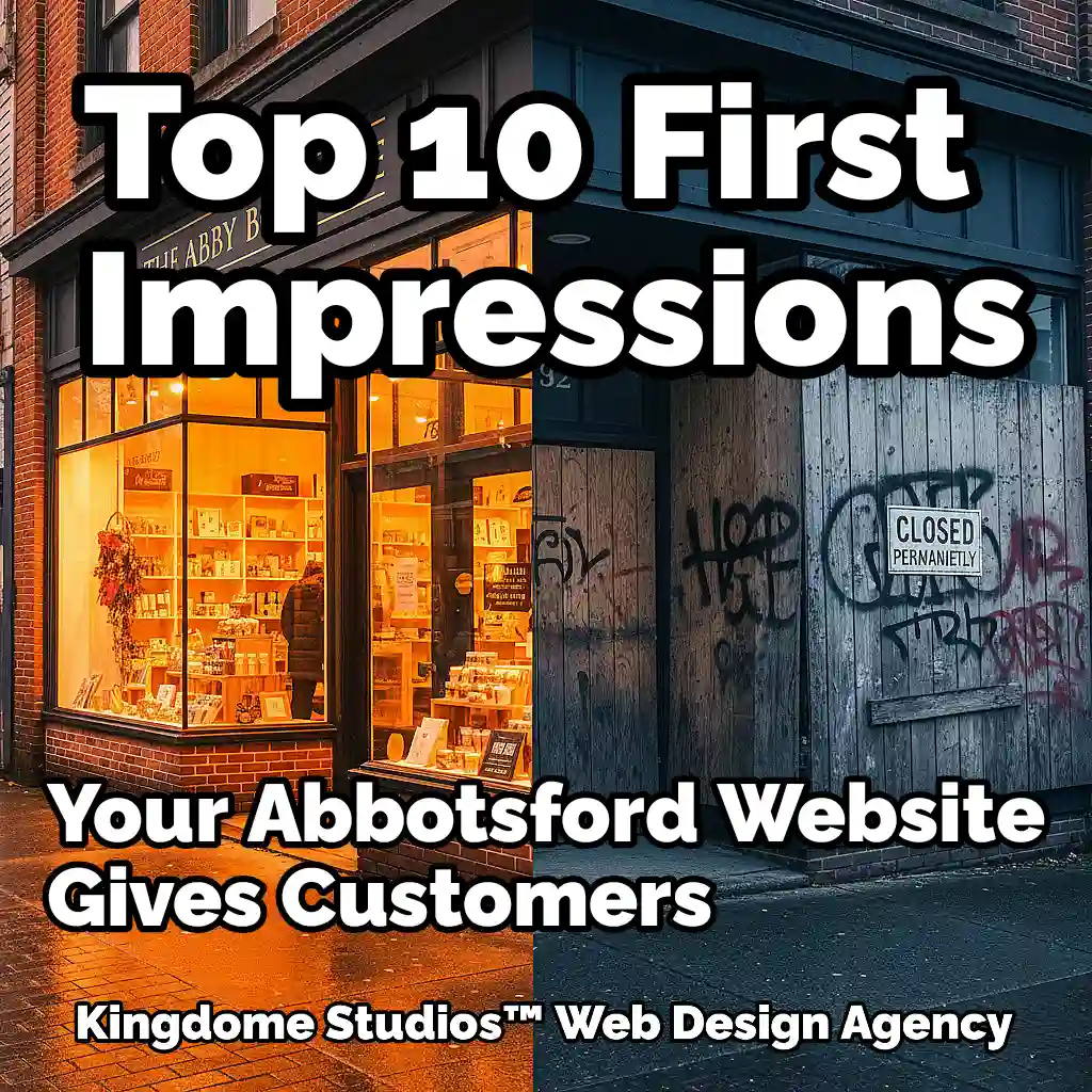
Did you know it takes about 50 milliseconds for a visitor to form a first impression of your Abbotsford website? That’s not a typo. 0.05 seconds. Before they read your mission statement, before they see your prices, before they even process your company name, their brain has already made a series of snap judgments that will determine whether they stay or hit the “back” button. Your website’s design is making promises—or threats—in the blink of an eye. It’s the digital equivalent of a potential customer walking past your storefront in Historic Downtown Abbotsford; they instantly decide whether to walk in based on the vibe they get from the window display, the signage, and the overall state of the exterior.
So, what subconscious messages is your website sending to every potential customer in the Fraser Valley? What instant judgments are being passed on your business based purely on design? Let’s break down the 10 gut reactions your website is triggering in every new visitor, long before they’ve read a single line of text.
1. "This is a Real, Legit Business." (The Professionalism Vibe)
The Impression: The very first checkmark in a visitor’s mental list is, “Is this a real company or some fly-by-night operation?” A professional design instantly signals that you are established, stable, and serious about what you do.
The Cause: This feeling is triggered by a clean layout, a high-quality logo, consistent branding, and a general sense of order. It’s the absence of chaos. It looks like it was built by a professional, for a professional.
The Local Analogy: It’s the difference between a professionally printed and designed banner you’d see at a booth at the Tradex, versus a sign handwritten on a piece of Bristol board. Both might be for legitimate businesses, but one inspires immediate confidence. Your website is your digital banner, and it needs to look the part. Custom web design is the foundation of that professional first impression.
2. "I Can (or Can't) Trust These Guys." (The Trustworthiness Factor)
The Impression: This is a gut feeling. It’s the subconscious sense that your business is safe to engage with. It makes a visitor feel comfortable enough to stick around, and eventually, provide their personal information or credit card details.
The Cause: Trust is built with visuals. High-quality, authentic photos of your actual team and location are huge. The presence of a small padlock icon (an SSL certificate) in the address bar is a massive, non-negotiable trust signal. A clean, modern design feels more secure than a dated, broken one.
The Local Analogy: Think about choosing a food truck at the Abbotsford Agrifair. You’re instinctively drawn to the one with a clean-looking kitchen, professional signage, and happy-looking staff. You’ll actively avoid the one that looks grimy or disorganized, even if the menu sounds good. Professional website photography and videography is the digital equivalent of that clean, trustworthy kitchen.
3. "This is Going to Be Easy (or a Headache)." (The Clarity Check)
The Impression: Before they even try to click, a visitor can feel if your website will be easy to use. Their eyes scan the page for familiar patterns: a clear navigation bar at the top, a logo in the top-left, and a logical flow of information.
The Cause: A cluttered, chaotic layout with links scattered everywhere creates instant anxiety. It tells the user, “This is going to be work.” Conversely, a clean layout with obvious navigation and generous white space tells them, “This will be a smooth, stress-free experience.”
The Local Analogy: It’s the difference between navigating the beautifully marked, paved walking trails around Mill Lake Park versus trying to find a shortcut through an unkempt field. One is a pleasant, easy journey; the other is a frustrating chore that might make you turn back. Intuitive UI/UX design ensures your visitors always have a clear, easy path.
4. "They're Up-to-Date (or Stuck in the Past)." (The Modernity Meter)
The Impression: Is your business a cutting-edge leader or a relic? Your website design is the primary indicator. Modern design trends, fonts, and animations signal that your business is current, relevant, and in tune with today’s market.
The Cause: Outdated design elements like bevelled buttons, drop shadows, or tired-looking fonts are a dead giveaway. It tells the user your business hasn’t updated its digital presence in years, which makes them wonder what else is outdated—your products, your services, your methods?
The Local Analogy: A business that relies solely on a newspaper ad in 2025 feels worlds apart from one running a dynamic, engaging campaign on social media. Your website’s design is that same signal. We ensure your website is built with modern web design trends that position you as a forward-thinking industry leader.
5. "They Care About Their Customers." (The User-Centric Vibe)
The Impression: This is a subtle but powerful one. A visitor can instantly feel if a website was designed with them in mind. The biggest tell? How it looks on their phone.
The Cause: If a user has to pinch, zoom, and scroll horizontally to navigate your site on their mobile device, you’ve sent them a clear message: “We didn’t bother to consider how you browse the internet.” It feels dismissive and disrespectful of their time and experience.
The Local Analogy: It’s like a popular shop in Historic Downtown with a narrow, cluttered entrance and no wheelchair accessibility. It signals that not all customers are a priority. A mobile-first responsive design is the digital equivalent of a wide, welcoming, accessible front door for everyone.
6. "This is a High-End (or a Bargain-Bin) Brand." (The Perceived Value)
The Impression: Your website’s design instantly places your business on a value spectrum. It can scream “premium and exclusive” or “cheap and cheerful” without a single price tag being shown.
The Cause: Luxury and high value are communicated visually through minimalist layouts, elegant typography, artistic photography, and a sophisticated color palette. A “budget” feel is created by crowded layouts, loud colours, flashing banners, and low-quality stock photos.
The Local Analogy: Compare the refined, spacious, and curated shopping experience at a high-end boutique in Highstreet Shopping Centre to the chaotic, jam-packed environment of a discount bin store. The design of the space itself dictates your perception of the products’ value. Strategic branding and design ensure your website communicates the exact level of quality you offer.
7. "They Know What They're Doing." (The Expertise Signal)
The Impression: Does your business seem organized, professional, and authoritative? A polished and well-structured website design subconsciously transfers those qualities to the business itself.
The Cause: A clean, logical, and consistent design implies that the business behind it is also clean, logical, and consistent. It suggests a high level of attention to detail and a commitment to excellence. A messy, inconsistent design implies a messy, inconsistent business.
The Local Analogy: Think of a presentation at a business conference at the Tradex. The speaker with a polished, well-designed, and easy-to-follow slide deck is immediately perceived as more credible and expert than the speaker with cluttered, mismatched, and typo-ridden slides. Your website is your most important presentation. We build websites that establish your brand’s digital authority.
8. "This is a Real Abbotsford Business." (The Local Connection)
The Impression: A visitor can instantly feel if a company is a genuine part of the local community or a faceless national corporation with a generic “Abbotsford” landing page.
The Cause: The use of authentic imagery featuring recognizable local landmarks, landscapes, and people is key. Even subtle color palettes that evoke the green of the Fraser Valley or design motifs that hint at our agricultural roots can create a sense of place. A generic template feels placeless.
The Local Analogy: Seeing a stunning photo of the Mount Baker sunrise or the vibrant colours of the Abbotsford Tulip Festival on a website instantly creates a bond. It says, “We’re not just in Abbotsford, we are Abbotsford.” As your local Abbotsford web design experts, we know how to weave that local DNA into your digital presence.
9. "This is Going to Be Quick (or a Waste of Time)." (The Performance Vibe)
The Impression: Even before the page fully materializes, the speed at which it starts to appear sends a powerful message. A fast-loading site feels efficient, modern, and professional. A slow one feels broken, frustrating, and disrespectful of the user’s time.
The Cause: This is a purely technical impression. The initial server response time and the speed at which the first visual elements load are critical. Any lag, however small, plants a seed of doubt.
The Local Analogy: It’s the difference in perceived power and efficiency between a CF-18 Hornet blasting off the runway at the Abbotsford Airshow versus an old propeller plane sputtering to life. One screams performance and power; the other, not so much. Performance optimization is built into our process to ensure your site has that jet-fueled feel.
10. "I Know What to Do Next." (The Action-Oriented Impression)
The Impression: Within a second, a user’s eye is naturally drawn to the most prominent element on the page. Is it a clear, compelling button that says “Shop Now” or “Get a Quote”? Or is it a confusing mess of options?
The Cause: The size, color, contrast, and placement of your primary call-to-action (CTA) button tells a user if your site is built for action or just for passive viewing. A clear CTA provides an immediate sense of purpose and direction.
The Local Analogy: It’s like a well-designed building with bright, clear “Exit” signs. You never feel lost because you always know where to go next. Our conversion-focused web design acts as that clear signage, ensuring your visitors are never left wondering what to do.
Your First Impression is Your Only Impression
The Impression: Within a second, a user’s eye is naturally drawn to the most prominent element on the page. Is it a clear, compelling button that says “Shop Now” or “Get a Quote”? Or is it a confusing mess of options?
The Cause: The size, color, contrast, and placement of your primary call-to-action (CTA) button tells a user if your site is built for action or just for passive viewing. A clear CTA provides an immediate sense of purpose and direction.
The Local Analogy: It’s like a well-designed building with bright, clear “Exit” signs. You never feel lost because you always know where to go next. Our conversion-focused web design acts as that clear signage, ensuring your visitors are never left wondering what to do.